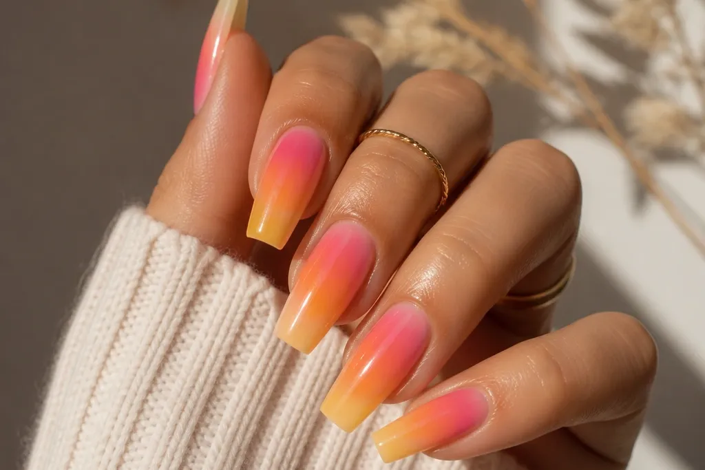
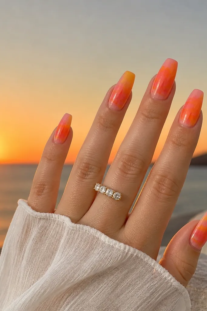
1. Coral-to-Violet Sunset Fade with Glass Topcoat
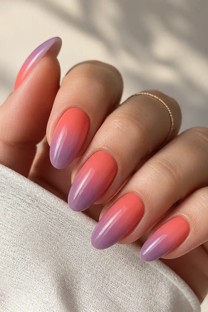
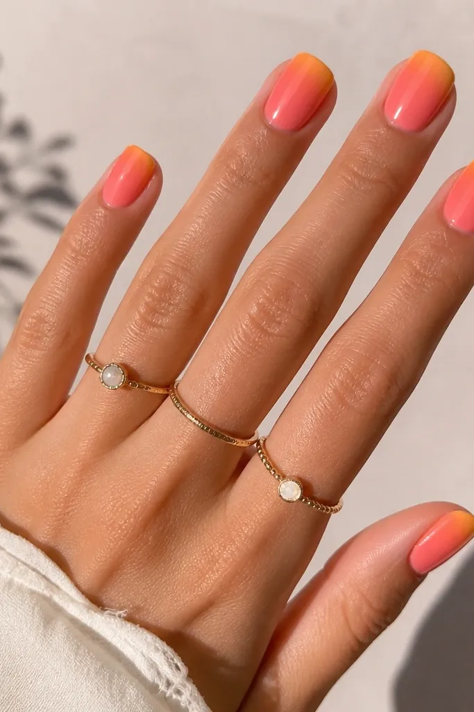
This is the "cleanest" sunset acrylic look because the gradient does the heavy lifting. Coral and violet are close enough in warmth-to-cool direction that the fade reads like a sky, not like two colors stuck together. A glassy topcoat makes the orange look like it's glowing, even with simple application.
Build the acrylic gradient with two passes: one thin coral layer up high enough to cover the cuticle area, then a second violet layer that starts around the mid-nail. Blend with a small brush in circular motions, then cap with clear acrylic or builder gel. Finish glossy - no matte here.
Pro tipKeep the coral slightly warmer than you think - peachy-coral looks more like sunset than bright orange.
Watch outAvoid a straight color line at the halfway point; it turns into a stripe by fill time.
2. Sunset Horizon Line with Micro-Glitter Smoke
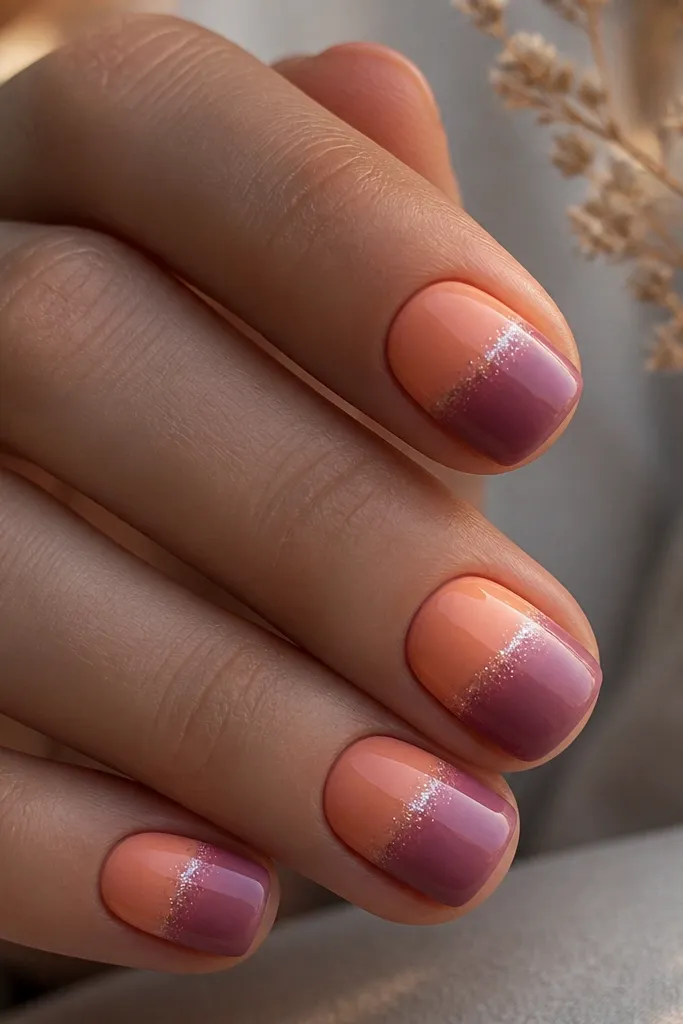
The horizon line gives the set structure, so it stays readable even when your nails grow. Micro-glitter smoke sits around the horizon - it catches light and hides tiny bumps or blending edges. This one always looks "expensive" because the glitter is controlled, not scattered.
Use a striping brush to draw a curved horizon line slightly above the center of the nail. Add a light haze of fine glitter gel just around the line, then blend the lower section with plum and warm pink. Topcoat glossy so the glitter looks suspended.
Pro tipIf you're filling every 3 weeks, place the horizon a little higher so it still looks centered after regrowth.
Watch outSkip chunky glitter flakes - they make the haze look like debris instead of atmosphere.
3. Orange Sun Disc over Deep Purple Night
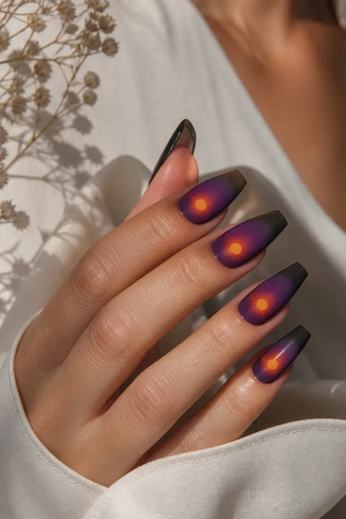
A sun disc creates instant "sunset" even if you keep the rest minimal. The glow is what makes it believable - a thin halo in coral/orange prevents the circle from looking sticker-like. Deep purple at the tip anchors the color so the orange pops without turning neon.
Paint the purple gradient first, fading darker toward the free edge. Then create a small sun disc using a gel paint circle brush or a tiny dot tool, sized about 1/4 of the nail width. Add a thin coral halo around it with a sponge or brush, then cap with clear topcoat.
Pro tipUse a matte or satin finish for the purple base, then keep the sun glossy - the contrast looks hand-painted.
Watch outDon't place the sun too close to the cuticle; it will look off by the time you fill.
4. Peach Sunset Ombre with Brown Warm Sky
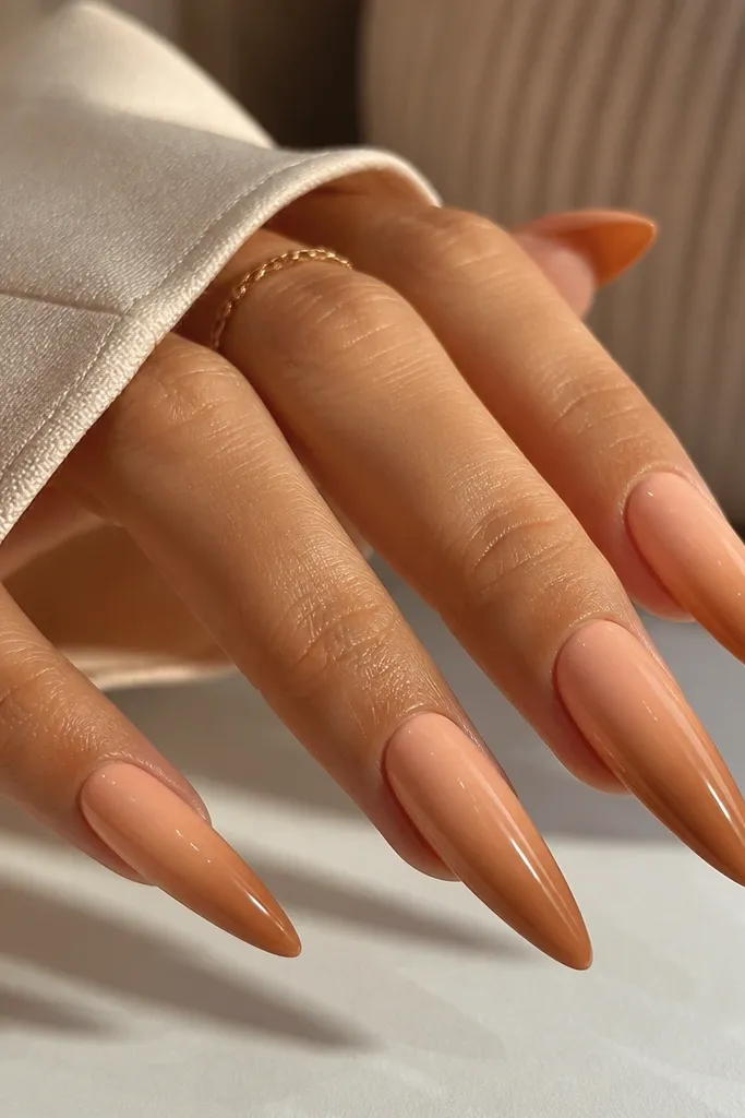
This sunset reads like late-afternoon warmth instead of beach neon. The brown component makes the gradient feel grounded, and it's forgiving when your cuticle line grows out because the warmer tones blend naturally. It also looks great on almond and stiletto because the fade follows the length.
Start with peach near the cuticle, then blend caramel/brown starting around 2/3 of the nail length. Keep the brown semi-transparent - you want smoke, not solid mud. Finish glossy to keep the peach looking juicy.
Pro tipIf your peach looks too light, add a whisper of coral to the mix instead of switching to orange.
Watch outAvoid a fully opaque brown tip; it makes the nails look dirty.
5. Magenta-to-Orange Sunset Skittle Set (5 Color Fade)
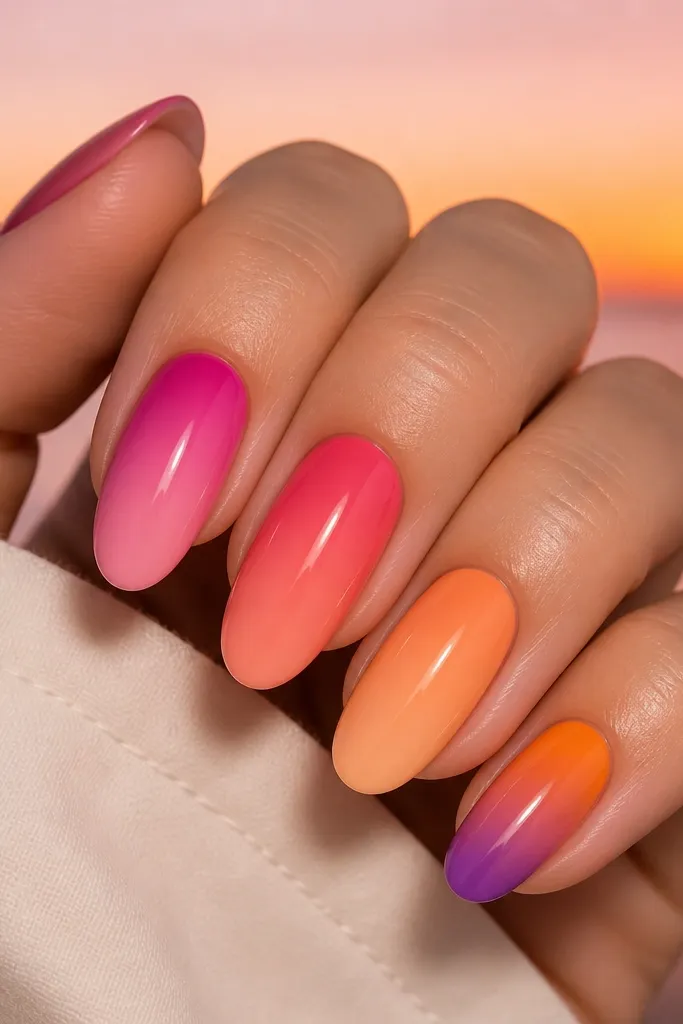
Skittle sets can look messy, but a sunset palette stays cohesive because the color direction is consistent. Each nail gets a "slice" of the sunset, so you get variety without losing the theme. The fade direction matters - it should flow from cuticle glow to tip dusk.
Pick five colors that sit in a single warmth-to-cool progression. Apply the lightest shade first near the cuticle, then blend into the next shade halfway down. Use the same blending technique on every nail so the transitions match.
Pro tipKeep the nail length consistent. Short nails make gradients feel banded; medium length shows the fade better.
Watch outDon't vary the fade direction nail to nail; it breaks the sunset illusion.
6. Matte Sky with Glossy Sun Rays
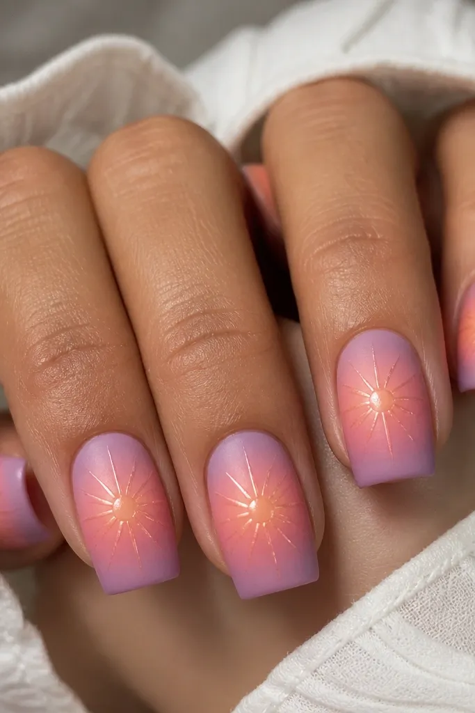
Matte reduces glare and makes the sky look like soft weather, not a painted sheen. Then the glossy sun rays hit the light and create that "photo filter" effect. This combination makes gradients look richer without adding extra pigment thickness.
Do the sunset gradient under matte topcoat, curing fully. Then draw 3-5 sun rays using glossy gel paint on a small center spot. Finish with a glossy topcoat only over the rays and sun area.
Pro tipUse a toothpick to pull the rays thin - gel paint spreads less if you work in tiny lines.
Watch outAvoid putting matte over the rays; it kills the contrast.
7. Sunset Waves with Navy Waterline
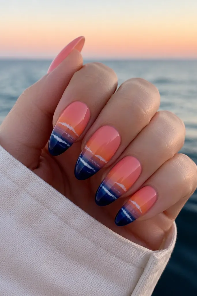
The navy waterline makes the sunset feel like it's happening at the beach. White foam highlights give depth and movement, and they also hide micro imperfections along the wave edge. It's one of the most "wearable" sunset designs because it reads clearly even from far away.
Gradient the top half from orange/coral into pink/mauve. Then paint a navy wave band starting around the lower third, using a thin liner brush. Add two thin white foam curves and a tiny dot highlight for sparkle.
Pro tipKeep wave lines slightly different on each nail so it looks natural, not copied.
Watch outSkip thick white lines; they look like stickers instead of foam.
8. Chrome Sunset Rim on Nude Base
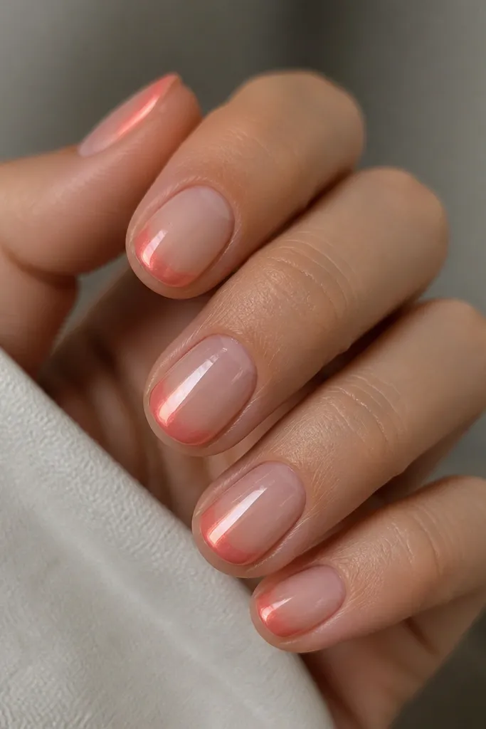
This is sunset vibes without full coverage color, and it looks clean with minimal length. The chrome rim catches light like a sunset edge on the horizon. Because the base is nude, it grows out with less visible line contrast.
Start with a sheer nude layer and a glossy base. Apply a warm orange-pink chrome powder or foil only in a curved band near the free edge, blending the edges with a soft brush. Seal with a high-shine topcoat.
Pro tipChoose a chrome that leans peach-pink, not pure gold - gold can make it look like a metallic manicure rather than sunset.
Watch outDon't overextend the chrome into the center; it becomes a harsh border.
9. Aurora Sunset Hologram Fade
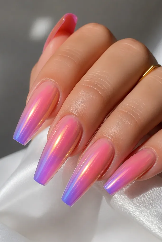
This one looks like sunset plus aurora. The hologram overlay makes the gradient look dimensional without heavy art. It's also great for parties because the color shift gives you movement even when your hands are still.
Build your coral-to-purple base gradient first. Then apply an iridescent holographic gel or thin holographic powder in a light veil over the mid-to-tip area. Cure and seal with glossy topcoat.
Pro tipApply hologram thinner than you think - it should tint, not cover the gradient completely.
Watch outAvoid thick hologram layers; they can look cloudy and uneven.
10. Sponge Blended Sunset with Burnt Sienna Top
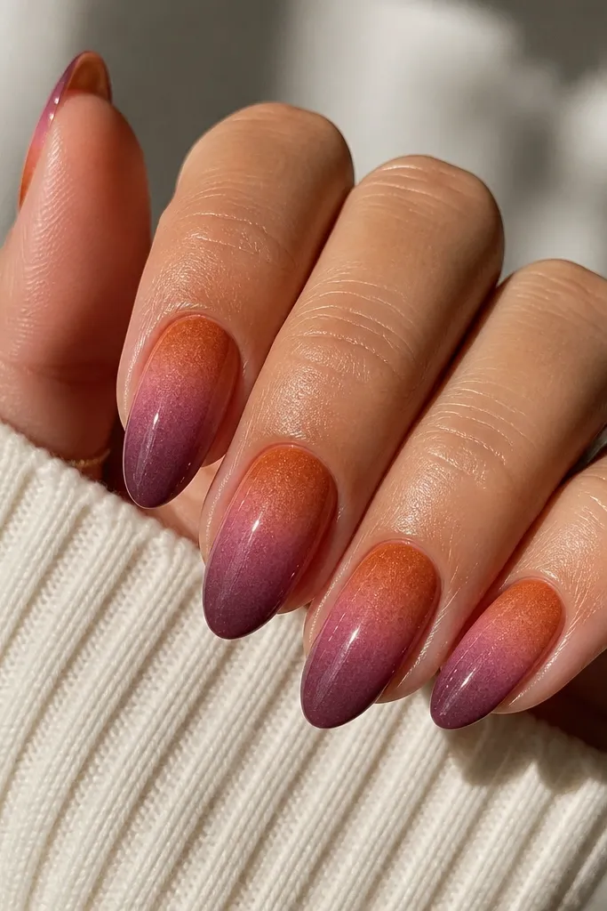
Sponge blending creates that lived-in sky texture - the color isn't perfectly smooth, so it looks more natural. Burnt sienna adds a realistic sunset warmth that bright coral sometimes lacks. The slight speckle also helps hide tiny brush marks from acrylic blending.
Use a makeup sponge cut into a small wedge. Dab burnt sienna on the upper third, then dab pink in the middle, then dab plum at the tip. Press lightly, cure, then topcoat glossy to even out the look.
Pro tipPractice on a fake nail first - you want airy dabs, not full coverage stamps.
Watch outDon't scrub the sponge; it lifts pigment unevenly.
11. Sunset Ombre French Tips with Micro Stars
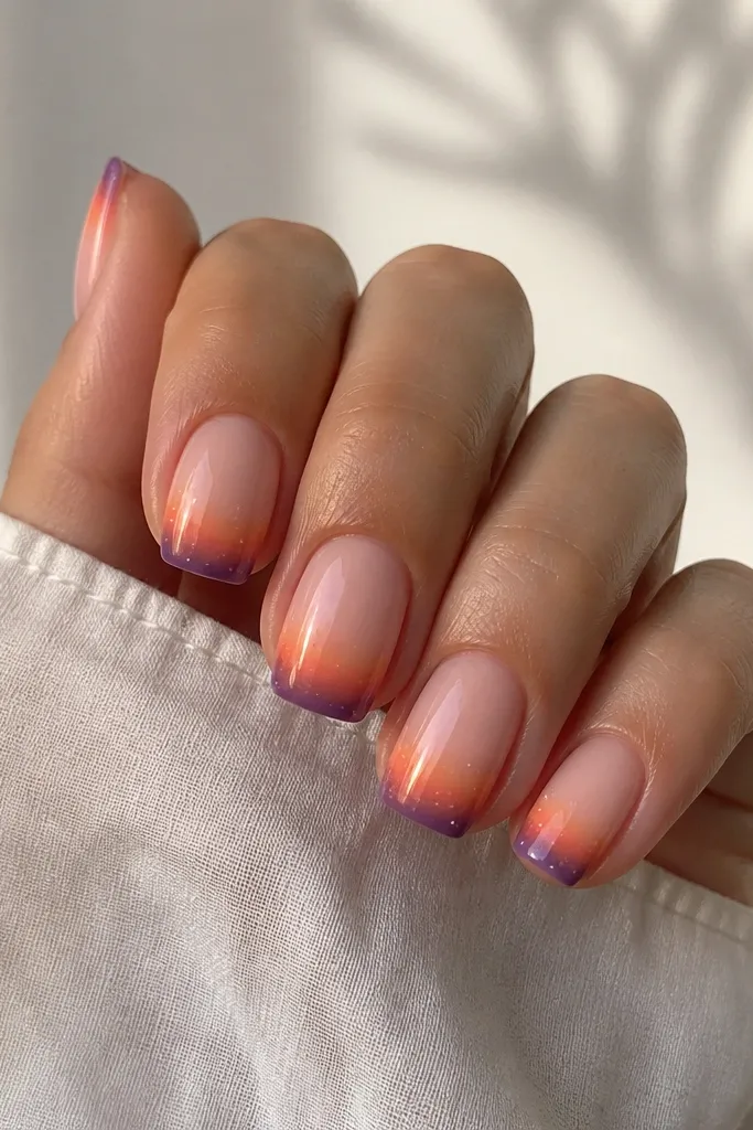
French shape makes the nails feel neat, and the sunset tip keeps it fun. Micro stars add a "night after sunset" vibe without turning into a full glitter bomb. This design is great if you want nail art that still looks office-appropriate.
Mask the base area with a clean tape strip to keep the French line crisp. Blend orange into pink at the tip, then fade into violet right at the edge. Add 3-6 tiny star dots using a dotting tool and white or pale gold gel.
Pro tipKeep the star dots smaller than a sesame seed grain - tiny stars look intentional, big ones look juvenile.
Watch outSkip thick star outlines; they look like pasted decals.
12. Layered Sunset Cutout with Clear Negative Space
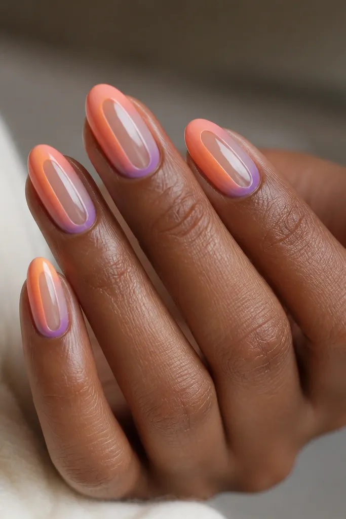
Negative space keeps the set light and makes the sunset feel graphic. The clear strip also hides small growth-line issues because your eye goes to the design bands instead of the cuticle. Layered color bands look bold even with simple blending.
Apply acrylic or gel in band layers around a protected clear strip, leaving the center bare. Use peach, then orange, then a thin violet layer near the tip. Seal with topcoat carefully so the clear area stays crystal clear.
Pro tipUse a thin strip of tape to define the negative space; peel it before topcoat for the cleanest edge.
Watch outDon't flood the negative space with gel; it turns cloudy fast.